Basic Objects and User Interface
Basic objects
|
Field |
Symbol |
Description |
|---|---|---|
|
Date Box |
|
Allows the user to select a date. Users can key in a date or select a date from a calendar form by clicking on the "Calendar" button.
|
|
File Selection |
|
Allows the user to select a file to attach to the field. |
|
Flags |
|
Allows the user to turn specific fields on or off. |
|
Formatting |
|
Allows the user to select formatting properties such as text size or grid coloring. |
|
Memo |
|
Allows the user to input a string. Once the user starts typing in a memo field, a window will be displayed that allows the user to type in the desired text.
|
|
Pick List |
|
Allows the user to select from a predefined list of options. |
|
Searchbox |
|
Allows the user to select from a predefined list of options. When the user selects the searchbox icon or begins to type within the field, a window will open that allows the user to select the appropriate option. When the user begins to type within the field, the text select will automatically be input into the searchbox. |
|
Text Box |
|
Allows the user to input a string. Text fields are limited in string length and the system will automatically cut off the user from typing beyond this limit. Details on text field masking are included below. When typing in text fields and misspellings occur, uses can right-click on the line that appears under the word to bring up the spell check window. |
|
Web Link |
|
Allows the user to input a string that contains a link to a website. When selecting the icon in the right side of the field, the user will be directed to that link. |


Field colors
- All required fields are shown in blue.
- All fields that have been changed since the last save are shown in red.
- All disabled fields are shown in gray.
Languages and caption widths
The ability to modify the language and width of the captions displayed on forms is handled via System > Maintenance > Captions. Once users navigate to this location they will be presented with the list of all captions available in the system. Users have the ability to create a new user version of the existing system caption. If a user version exists for a caption, the system will use this caption instead of the system caption. User captions can be added, modified, and deleted via the Captions form, however users may not modify or delete system captions.
Subtotaling report results
To subtotal report results, perform the following:
- Click on the "Subtotal Report" button in the toolbar of the report results grid to open the Subtotal Results form.
- Users may select up to 4 fields. Click on the "Summary" button to open the View Subtotals form, which displays the summary lines only.
- Click the "Preview" button to open a preview window of the hard copy report with details.
- To print the hard copy report, click on the "Print" button on the Subtotal Results form.
Drill down capabilities
Many areas of Deacom offer a drill down capability. Double-clicking on a line will show the detail behind the information on the line.
Deacom Toolbar
The Deacom Toolbar is located at the top of every grid or report in the system. The table below details all the fields available on the toolbar.
|
Field/Button |
Description |
|---|---|
|
|
Print contents of current grid. Report is editable from Printed Reports toolbox and toolbox2 reports. |
|
Excel |
Exports the contents of the current grid to an Excel file. |
|
Filter / Sort |
Allows user to sort by any column of the current grid or create multiple filters for the data. |
|
Refresh |
Refreshes the data in the current grid. |
|
Auto Refresh |
Automatically refreshes the data periodically if selected. |
|
Subtotals |
Allows user to subtotal the grid by various system fields. |
|
Graph Data |
Displays the Graph Data form where users may create various graph types. Graphs can be saved, refreshed, or printed. Additional information regarding Graphs is available via Deacom Basics > Graphs. |
|
Publish Data |
Allows user to save reports as a BI DataSet, Combined Report, Favorite, or Favorite With Preview. For more information, refer to BI and Graphs and Managing User Favorites and Previews. |
|
Show Fields* |
Displays a list of the fields available for use in the grid. Grids may contain two different field types:
|
|
Grid Layout* |
Provides access to the Edit Grid Layout form and complete control of which fields are displayed on the grid and in what order. Additional information is available in the Edit Grid Layout Form section further down on this page. The security setting "Toolbar -- edit grid layouts" controls access to this button.
|
|
Save Layout* |
If clicked, the currently displayed layout will be saved as the default the next time the grid/report is generated. |
|
Record History |
Shows all user modifications made to the highlighted entry including who made the entry and when. This feature is very useful to see the changes that have been made to master records, like item masters, security permissions, sales, jobs and purchase orders throughout the system. |
|
Help |
Launches the Deacom Help System. |
|
Filters |
If clicked, displays the current filters set on the pre-filter for the selected grid. |
|
Search Bar |
Allows users to search for records, values, or fields in the grid report. The search will be performed for the selected column. The selected column will contain a downward or upward pointing carrot. Users can change the selected column by double clicking on the column header. In addition, the search box contains an "All" checkbox. If checked, this indicates that the search will be performed on all columns in the report. |
*These three buttons allow users to configure grids to suit the needs of the company, individual Users, or User Groups.
Grid layouts
In Deacom the report or list that is generated via the pre-filter is referred to as a grid. The section below lists all the fields available to the Grid Layout form and supporting forms.
Edit Grid Layout form
Opened via the "Grid Layout" button on the Deacom toolbar. When a user version of a system grid is created, the word "User" will be displayed in parentheses on the Grid Layout button located on the Deacom Toolbar for that grid.
|
Field/Button |
Description |
|---|---|
|
Name |
Displays the name of the grid. |
|
Grid Code |
Displays the name of the grid as referred to in the code. |
|
Title |
30 character description.
|
|
Grid for |
Options include: All users, Specific User, and User Group. |
|
User Group |
The field will open to select the appropriate value when either "Specific User" or "User Group" is indicated in the "Grid for" field. |
|
Script |
Memo field used to create a script for the selected Grid Layout. The security setting "Tools -- edit scripts" controls access to this field. Additional information on scripting is available via the Configuring Through Code page. |
|
Advanced Filter |
Searchbox that allows a user to apply a previously made active filter into the selected grid, implementing fields such as Logic, Operator, Value, and Type. More information on creating filters can be found in Configuring Grid Layouts and Automated Reports.
|
|
User Auto-Refresh |
The primary functionality of the User Auto-Refresh and User Parent Refresh option below is to give the customer the option to update records right away or when needed. Some companies might contain a large amount of records and might take a few minutes or hours to update them all. Attempting to update all the records during work hours will cause the program to slow and the company to fall behind schedule. This "User Auto Refresh" field is used to update all the records automatically when an update occurs to a record and keeps all the records up to date with the latest changes. It is set to "On" by default but can be configured by drilling into a management form, then selecting the modify layout option. Options are:
|
|
User Parent Refresh |
Used to update the parent form when the child form is saved. If turned on, when the user hits save, the parent form will automatically update. If turned off, the parent form will not update until the child form is closed. It is set to "On" by default but can be configured by drilling into a management form, then selecting the "Modify Layout" option. Options are:
|
|
Device |
Pick list used to indicate the application where the grid will be applied. Options are:
|
|
Pinned Columns |
Defines the number of columns, beginning on the left, that will be pinned or frozen on the grid. Example: If your report has 30 columns, entering a value of 2 will result in the two leftmost columns being frozen as the user scrolls from left to right.
|
|
Mobile |
If checked, indicates that the mobile specific grid for this system grid will be made available to mobile application. The mobile specific grid is a simplified version of the default system grid containing the core information for the report. |
|
System Auto-Refresh |
Informational only. If checked, determines whether the grid will refresh itself automatically after modifying an entry and exiting, such as Category Maintenance or the PO Summary report. |
|
Auto Resize Columns |
When checked, it enables automatic column resizing on the BI grid, so that columns are resized to fit their content when the grid is rendered on a BI Page. This ensures that all data in the grid is fully readable without manual column width adjustments.
|
|
System Parent Refresh |
Informational only. If checked, determines if editing an entry will update the parent form's grid before the entry form is closed, such as the Edit PO form's grid when editing PO line items or the Edit Financial Statement form's grid while editing the statement line items. |
|
Require Grid Security |
If checked, this Grid Layout will be added to the Grid Layout Security form.
|
|
Add |
Click to add fields to the grid. See the Edit Grid Column Form section below for additional details. |
|
Modify |
Click to modify existing fields in the grid. |
|
Delete |
Deletes the selected field from the grid. |
|
Delete All |
Click to delete all the fields on the current grid. If the "Save" button is clicked without any fields on a grid the program will restore the system default fields for this grid the next time it is run. |
|
Sort |
Click to change the sort order of the fields on the current grid. Deacom Web Versions include an enhanced “Sort” button that displays additional information for the underlying data or grid. In addition to providing more information, users now have the option to sort any column alphabetically, not just the first column as was the case in previous versions. The option is available when clicking the “Alphabetical” button. |
|
Save |
Saves all changes made to the grid layout. The "Save Button" field in System > Options determines if clicking the save button commit changes or both commits changes and closes the form. |
|
Undo |
Reverses any changes made since last save. |
|
View Docs |
Allows users to attach files or pictures directly to the selected Grid Layout as well as email the attachments. Once users click the "Add" button they are presented with the Edit Document Entry form which allows users to select the specific document to attach, enter a description of the document and select the appropriate Document Category. |
|
Layout |
If clicked, opens the Form Layout for the current grid. |
|
Exit |
Closes the Edit Grid Layout form. |
Note: Resize all grid columns with a double-click - Double click on the left-most gray box on a grid of information to automatically resize all the grid columns. Double click on an individual column margin to automatically resize just that column
Edit Document Entry form
|
Button |
Description |
|---|---|
|
Name |
Field used to find and select the actual Document. |
|
Description |
Displays a description of the Document. |
|
Document Category |
Search field used to assign the document to a Document Category. |
|
Print Destination |
Option to specify a printer where the attached file will be printed instead of the printer defined in the "Print Destination" field on the Report Layout or Part Form.
|
Export Format section (Grid Printouts)
The Export Format section allows users to build custom report layouts or export to text files from the grid. The custom report layout option allows users to create unique reports by using data from grids as inputs to specified Print Outs. Additional information is available via Print Outs > Maintenance > Report Layouts. The export to text files option is useful in situations where customers need to send report information to banks, for example, which generally only accept text files.
The Export Format form is opened via the "Add" or "Modify" button in the Export Format section.
|
Field/Flag |
Description |
|---|---|
|
Name |
Enter the name of the Export Format. |
|
Type |
Select "Print Out" or "Text." |
|
Report |
Select an available report.
|
|
Text |
|
|
Default |
If checked, indicates this is the default Export Format for the selected grid. |
Edit Grid Column form
Opened via the "Add" or "Modify" buttons on the Edit Grid Layout form.
|
Field/Button |
Description |
|---|---|
|
Field |
Pick list of available fields. In addition, there is an option to have the field defined by the user via the "User-Defined" option in the list. The "User Expression" field, defined below, is used when creating a user-defined field. Note: All Item Master UDFs are available to the purchase order line grid. |
|
User Expression |
Available only when the user-defined option is selected in the "Field" pick list. User expressions can access fields that are already in the grid or fields that are available to the grid display (which can be shown through the View All Fields button on the grid toolbar). Functions and operators as defined in Deacom Basics > Functions and Operators Library can be used to format user expressions. |
|
Title |
Enter the name that will be displayed as the column heading, up to 30 characters. |
|
Width |
Default width of the column. |
|
Format |
Option to enter pre-defined FoxPro format options such as left, center, or right justify. Rarely used; generally left blank. This field can be used create a variety of formats for output generated from Field controls by creating a format string expression. A format string contains format codes and format templates. Format Expression for Field Controls
Format codes apply to all the characters in the Field control expression and must be preceded by the at sign (@) in the format string. For example, you can pad a numeric value with leading zeros instead of spaces by using the format string "@L 999999". Format Code Description Applies to date of type ! - Force text to uppercase. Character only L - Show Leading zeros. Numeric only Z - Blank if zero Numeric, Date, and DateTime ( - Surround negative numbers (). Numeric only . - Generates a mask that hides leading zeros and shows trailing zeros - - Shows all digits in the mask , - Displays commas in numeric values C - Appends "CR" to positive, non-zero numbers. Numeric only X - Appends "DB" to negative, non-zero numbers. Numeric only $ - Uses currency notation. Numeric only YL - Display using system Long Date format. Date
YS - Display using system Short Date format. Date
R - Prevents non-formatting characters in the template string from, replacing the corresponding character of the field expression value, When @R is used, the template string interleaves instead of overlaying. (See example below.) Character and Numeric Notes
Format template characters apply to individual characters in the Field control expression. You can create a pattern with format template characters with each character in the template representing a character you want to display. For example, some characters in a format template alter the display of specific character types. For example, including the character "Y" in a format template for a logical expression displays the letters "Y" instead of ".T." for True and "N" instead of ".F." for False. The character "9" in a format template is a placeholder for any digit in character or numeric data. Other format template characters, such as parentheses, spaces, and hyphens, display as themselves.
The following examples show how format codes and format template characters work together to create the output: Field Expression Value Format String Rendered Output -43.05 @(CX 999.999( 43.050 DB) 65.43 (999) 999-9999 ( ) - -43 "4505551023" (999) 999-9999 (505) 102- "4505551023" @R (999) 999-9999 (450) 555-1023 ca90210 @R !! 99999 CA 90210 |
|
Input mask |
Controls how number values will be displayed and is used for formatting purposes only. (i.e. 999-999-9999 for phone number.) Use "9" for digit placeholders.
|
|
iPhone Field Type |
Used in connection with the "iPhone" flag on the Edit Grid Layout form. Option to select if the selected field will be a primary or secondary field on the iPhone display. Primary fields will be displayed in a larger font and generally on top of secondary fields. |
|
Sort descending |
If checked, the first double-click on a column header sorts in descending order. |
|
Sum |
If checked, indicates column will be summed and results will be displayed underneath the toolbar on the report the next time it is displayed. Only numeric fields can be summed. |
|
Include in preview |
If checked, indicates this field will be displayed in the print preview. This is applicable for user defined columns that have this flag checked. |
|
Time field |
If checked, requires field to be entered in the following time format: MM:HH PM/AM. |
|
Previous |
Moves to the previous field in the grid. |
|
Next |
Moves to the next field in the grid. |
|
Save |
Saves all changes.
|
|
Undo |
Reverses any modifications since last save. |
|
Exit |
Closes the Edit Grid Column form. |
Custom Criteria
The majority of pre-filters throughout the system contain a custom criteria option. In classic versions, the custom criteria section is displayed as a series of search boxes at the bottom of the pre-filter. In web versions, the custom criteria section is displayed once users click the "+" sign at the bottom of the pre-filter.
Custom criteria allows users to search using fields not normally found on the pre-filter form. For example, when using the Sales > Order Reporting pre-filter, the custom criteria section can be used to search fields contained on the Bill-to or Ship-to records.
Edit Custom Criteria form
|
Field |
Description |
|---|---|
|
Logical |
Options are "And" and "Or". Allows users to filter based on resulting criteria. "And" indicates all criteria must be meet in order to return results on the report. If set to "Or", indicates it is optional that the data be returned. |
|
Table |
Select from a list a applicable tables. The table presented depend on the pre-filter being used. For example, if using a Sales > Order Reporting pre-filter typical tables to choose from would include Bill to companies, Ship to companies, Sales order header, and sales order lines. |
|
Field |
Options depend on the Table chosen above.
|
|
Not |
Works in connection with the Operator field below and, if checked, will not include the criteria specified in the value field. |
|
Operator |
Defines what operator the system will use when filtering results. Options are: <, <+, <>, =, >, > =, Contains, Is Empty. |
|
Value |
Defines the value that will be filtered on when the search is performed. Will use units applicable to the selected Field. |
Mover form
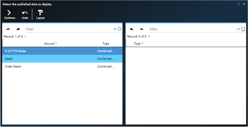
Mover forms are used to move multiple pieces of information or data in order to allow users to transact on them simultaneously. An example of a Mover form found throughout the system is shown below. Note that all Mover forms contain filters to make searching and grouping of data simpler. Mover forms contain move and move all buttons in the form of arrows to allow users to move information or data from one side of the form to the other. Once information or data has been moved to the right hand side users will click the "Continue" button to continue the process.
Masking
Integer: Allows only numeric characters and mask characters. No decimal point allowed. For example:
- Entering "a" will revert to "0".
- Entering "4.4" will round to "4" after the focus is changed.
Numeric: Allows only numeric characters and mask characters. Common masks are prices and phone numbers. For example:
- Entering "a" will revert to "0".
- Entering "6109712278" in a phone number field will bet set to "610-971-2278" after the focus is changed.
Standard Character: Character USD defined with a mask (XXXX). For example:
- A mask of "XXXX" will only allow four characters to be entered in the field.
Numerically Formatted Character: Character UDF defined with a number mask (9,999). Uses the @R transform function. The data is stored as a character rather than a number, making logical numeric operators unusable. For example:
- A mask of "9,999" will only allow integers 0 to 9,999 and will format the integers using the mask.
Non-Numeric Field with No Mask: Completely free-form fields.
Keyboard shortcuts and cursor focus characteristics
Deacom allows users to navigate through the menus and forms using keyboard shortcuts.
Menu shortcuts
- The TAB key can navigate between menu options and using SHIFT+ENTER will open the selected menu.
- When a menu is focused, UP, DOWN, LEFT, RIGHT, ENTER and ESCAPE maneuver within the menu. UP and DOWN vertically navigate. LEFT and RIGHT expand or collapse a sub-menu. ENTER runs a menu command. ESCAPE closes the menu.
- ALT+SHIFT+ (a-z, 0-9) performs the menu shortcut keys indicated by an underlined letter in the menu item. For example, ALT+SHIFT+P opens the purchasing menu and ALT+SHIFT+D opens the drop shipment form.
- For the legacy version of Deacom below 15.3 use CTRL+ALT instead of ALT+SHIFT.
Form shortcuts
- Right-Click Save and Close:
- Example: - On the Edit Sales Order form, right-click the Save button to commit your changes and return to the Sales Order grid in one step.
- Note: This behavior does not apply to the Cash Register interface, which remains unchanged.
- Shift+Alt+M : Feature Modify - Use Shift+Alt+M to activate the Modify icon on the features tree. Form layout shortcut assignments for feature-related actions are fully supported.
- Example: While viewing an item's features, press Shift+Alt+M to open the modify dialog for the highlighted feature without using the mouse.
- Tab/Enter in Features Tree - Use Tab to navigate between elements in the features tree and Enter to select the currently highlighted feature.
- Example: In the Features tree on an Item Master, press Tab to move focus to the tree, use the Up/Down arrow keys to highlight a feature, then press Enter to select it.
- Enter Key in Filter Forms - Pressing Enter in a filter form submits the filter criteria. It will not reload or refresh the entire browser tab.
- Example: On the Sales Order pre-filter form, type your filter criteria and press Enter to run the report. The form processes normally without reloading the page.
- To shift focus between open tabs, use ALT+SHIFT+(<,>).
- When tabbing on a form, the focused element is highlighted with a light-blue outline.
- The ALT+SHIFT+[a-z,0-9] shortcut performs the shortcut indicated by the underlined letter in the form buttons or navigates to a tab.
- For example, in the Edit Contact form, ALT+SHIFT+A adds a new note and ALT+SHIFT+2 opens the General 2 tab.
- Right-click on the caption of a field to view the data dictionary definition which includes the system field name, the Table description, the Field description, and other field-specific information needed to add columns to reports, write queries and troubleshoot issues.
- When focused within a form, ESCAPE will close the form and tab and the next tab will appear.
Field shortcuts
- Date Entry — Auto-Populate Year: When typing a date directly into a date field, you can omit the year. Type the month and day, then press Tab — the system will automatically populate the current year.
- Example: Click into a date field, type 0101, then press Tab. The field will auto-complete to 01/01/2026 (current year).
- Search Box & Arrow Keys : The search bar on grids and toolbars fully supports arrow key navigation. After clicking into the search box, use the Up and Down arrow keys to navigate through search results.
- Example: On the Item Management grid, click into the Search Bar, begin typing a part number, then use the Down arrow key to move through matching results and Enter to select one.
- WMS Scanner Enter Key: On warehouse management (WMS) scanner devices, the physical Enter key triggers a field search, matching the behavior of the on-screen search action.
- Example: On a WMS handheld scanner, scan a barcode or type a value into a search field and press the physical Enter key to execute the search.
- Clicking in a date field and then pressing the "+" button on the keyboard enters Today's Date. The "+" and "-" keys can then be used to change the date forward or backward.
- When the focus moves to a grid layout, the top row will be shown with a blue highlight. Once in the grid, the UP, DOWN, and ENTER keys can be used to maneuver within the grid.
- When changing a value in a field for multiple records, click in the field, make the change, and then press the "Page Down" or "Page Up" buttons on the keyboard to navigate between records while keeping the cursor in the same field, same as the Previous/Next functionality. Changes are saved automatically.
- Right clicking in the left side text area of a Memo box will bring up the default browser context menu rather than the field info dialog. This allows users to paste text into the Memo box text area.
Cursor focus
Cursor focus and tab has been enhanced
- General Keystroke Reliability - Keyboard inputs — including Escape, Tab, and arrow keys — respond consistently across all forms and do not lose responsiveness during extended sessions.
- Fields with an underline will display the underline as thicker and colored blue when the field has focus.
- Checkboxes can now be tabbed into, and will be colored when focused.
- In addition, when tabbing into a ComboBox, the outline will change to be thicker and colored blue to indicate the field has focus.
- When the user clicks on a section tab, the first unpopulated field will receive focus. If there are no unpopulated fields, the first field will receive focus.
Finding information faster
- Make menu selections Favorites - For frequently used menu items that may take a while to locate, drag the menu item into the Favorites section of the left navigation panel. This will add the item as a Favorite, accessible via a single click.
- Resize all grid columns with a double-click - Double click on the left-most gray box on a grid of information to automatically resize all the grid columns. Double click on an individual column margin to automatically resize just that column.
- Use wildcards in search fields - In Deacom, % and * are both considered "wildcard" characters, and can be used in searches.
- Identify a field name and other key pieces of information- Right-click on the field in question. This will provide the exact field name, the description of the table it belongs to, the field type, the maximum number of characters the field may hold, and
- The Toggle Chat